Brand statement
Rooted in history. Built for tomorrow.
 DERTHONA BASKET BRAND MANUAL
Brand manual · version 1.0
A contemporary basketball club shaped by heritage, culture and sporting ambition.
Explore the system ↓01
Brand foundation
Brand statement
Rooted in history. Built for tomorrow.
Vision
Derthona Basket as one of Europe’s most distinctive basketball clubs.
Mission
Strengthening the connection between club, city and community while building Derthona’s future on the European stage.
Design principles
Brand pillars
Tone of voice
How we speak
Confident
Authentic
Clear
Respectful
Ambitious
What this means
Never arrogant.
Identity, not trends.
Direct and intentional.
Inclusive by nature.
Think forward, aim higher.
Manifesto
We believe history is not something to preserve behind glass. It is something to build upon. Every generation leaves its mark. Every season becomes part of something bigger. The lion reminds us where we come from. The rose reminds us what we carry forward. Courage. Generosity. Grace. From Tortona to Europe. From tradition to tomorrow. One History. One identity. One Derthona.
Identity foundation
The lion
A historic symbol of the city, representing courage, generosity and grace.

The rose
A historic civic symbol carried forward as part of Derthona’s identity.
The typeface
A contemporary typeface built from the visual heritage of Tortona.
02
Logo
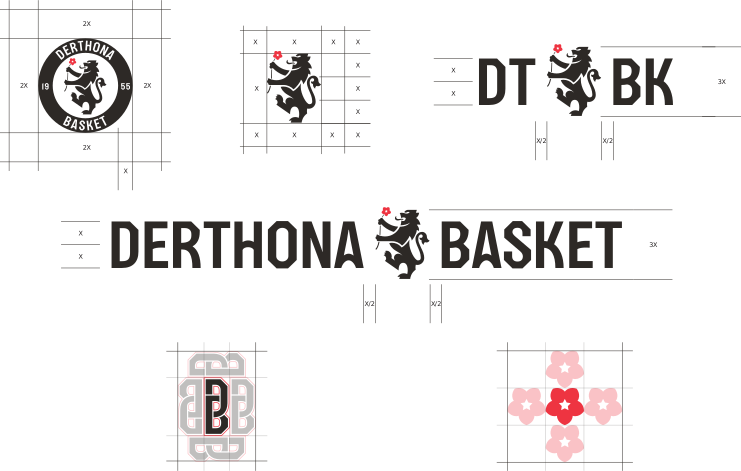
The lion, the rose and the custom typeface form one flexible identity system. Each signature is designed for a specific context, scale and format.
Responsive logo system
Drag the slider to change the available space. See how the Derthona signature adapts across different scales.





Clear space
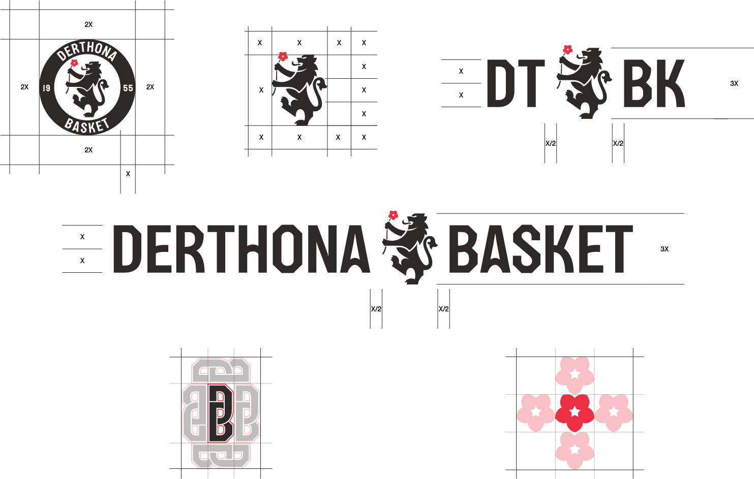
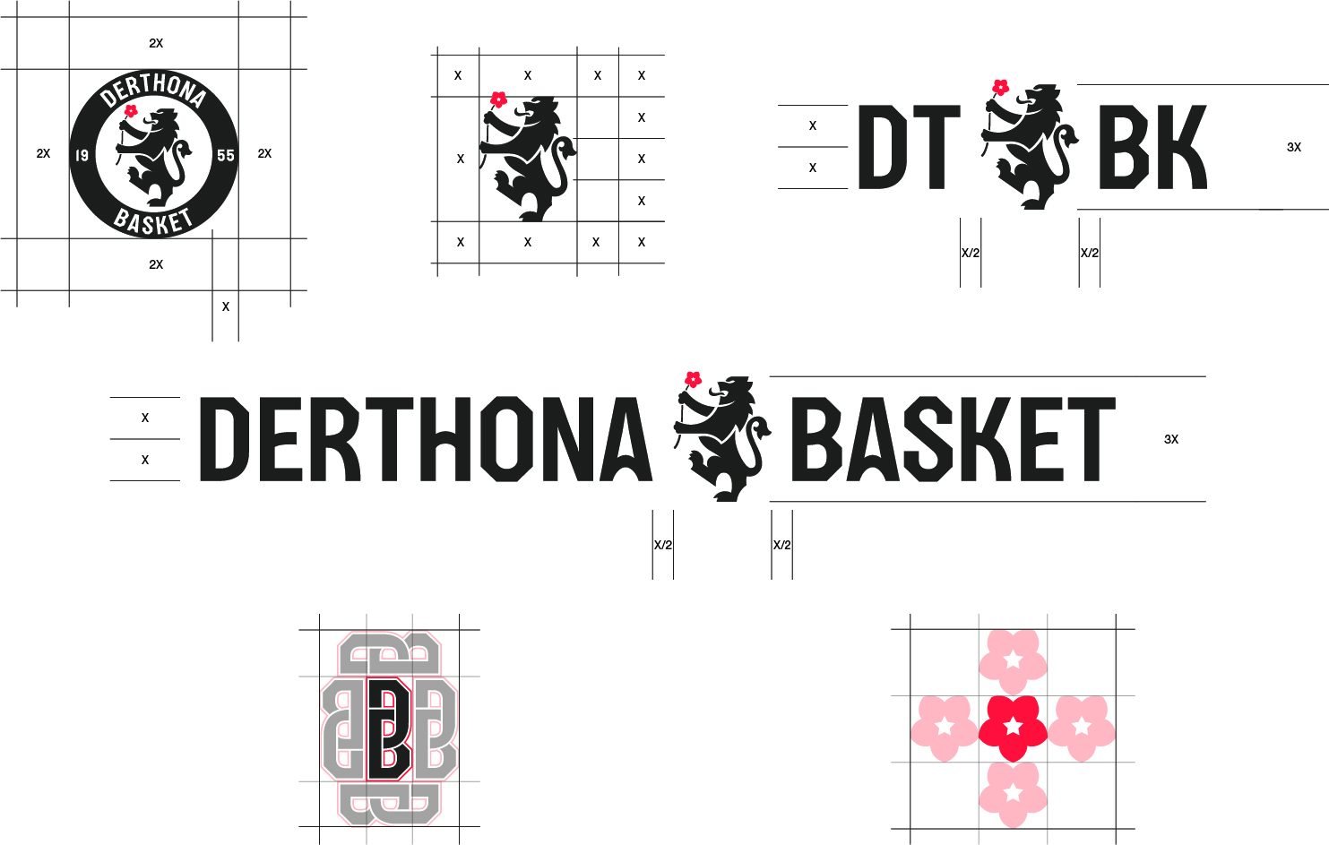
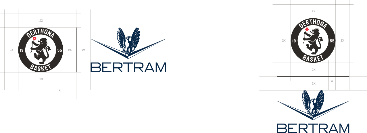
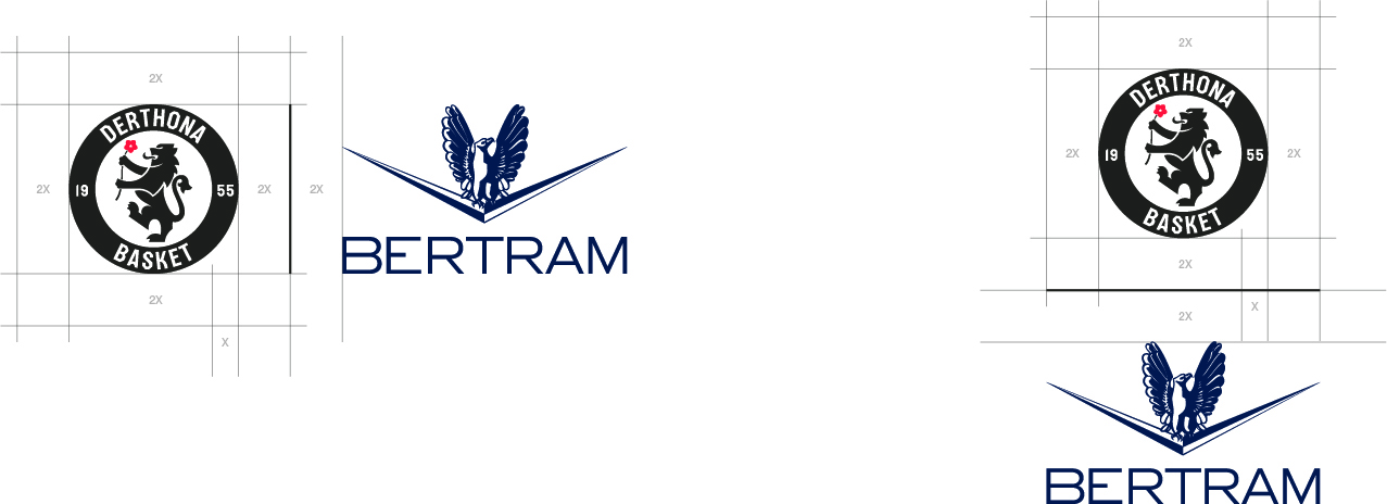
X is defined by the lion symbol. Internal proportions and a minimum clear space of 3X must always be maintained.
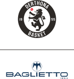
Composed logos
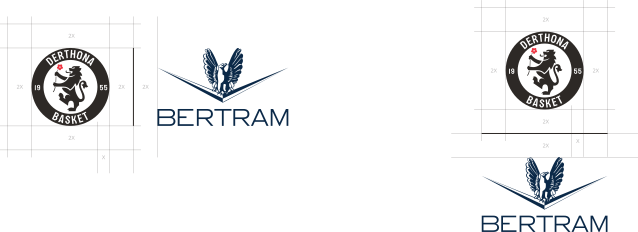
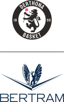
Choose the approved Crest or Lion construction. Always apply the larger respect area required by either logo. Separate the marks with a 1 pt line as wide as the larger logo, using black or white according to the background.


03
Color
Red brings the heritage of Tortona into the system. Black and white carry the club’s historic identity.
Select a color to copy its code.
04
Typography
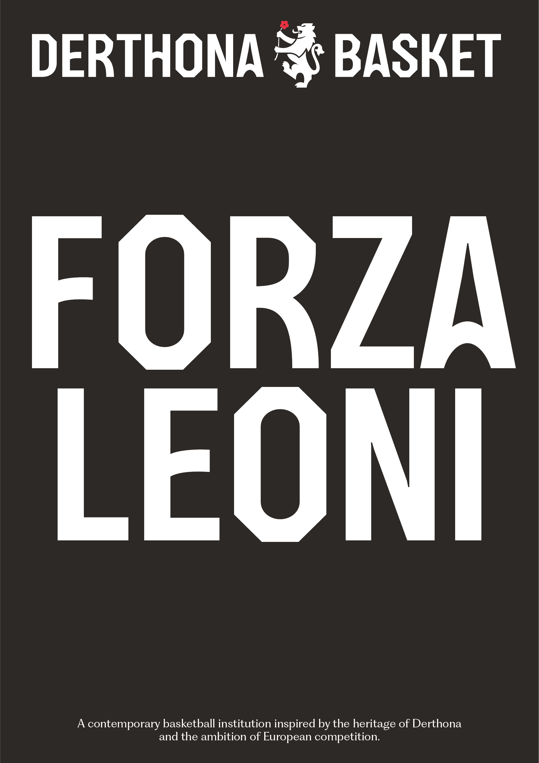
DERTHONA
BASKET
Custom typeface · Regular
A bespoke display typeface built from the visual heritage of Tortona and reinterpreted for a contemporary basketball identity.
Download font files
Usage principles
Three rules preserve the distinctive character, rhythm and hierarchy of Derthona Display.
01
Letter case controls the design of each character: lowercase typing produces the standard forms, while uppercase typing produces the alternate display forms where available.
The two styles may be combined, but each repeated letter must remain consistent throughout the same word, sentence or text block. For example, if an uppercase “A” is used for its alternate form, every “A” in that context should use the same form.
Always use the standard letterforms for editorial titles and headings.
To reproduce the official Derthona Basket wordmark, always use the supplied logo artwork rather than typesetting it from scratch.
02
Keep each line of text to a maximum of six words.
Short, compact statements allow the text to behave as a visual element and strengthen its graphic impact.
Whenever possible, set the leading to the same value as the type size. For example, 100 pt type should use 100 pt leading.
Derthona Display is intentionally tightly spaced. Always keep tracking at 0, use metric kerning and preserve the spacing built into the font.
03
Derthona Display should always be between 66% and 100% larger than the paragraph or supporting type used alongside it.
For example, if the supporting text is set at 30 pt, Derthona Display should be set between approximately 50 and 60 pt.
This difference creates a clear hierarchy while allowing the display type to lead the composition without overpowering the supporting information.
Try Derthona Display
lowercase standard forms · UPPERCASE alternate forms
Click to write your own text
01 · Derthona Display
ROOTED IN HISTORY.
02 · TeX Gyre Heros
A contemporary basketball identity inspired by history.
03 · PP Fragment
From tradition to tomorrow.
05
Brand templates
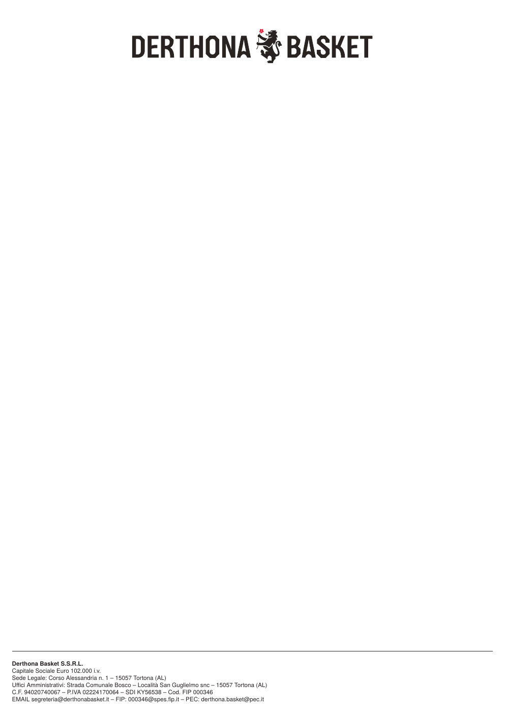
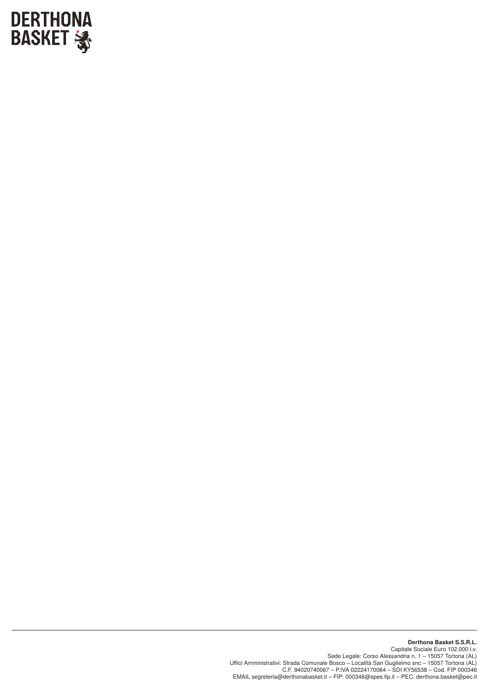
Approved business card artwork and current letterhead options. Download the supplied master files for production and adaptation.
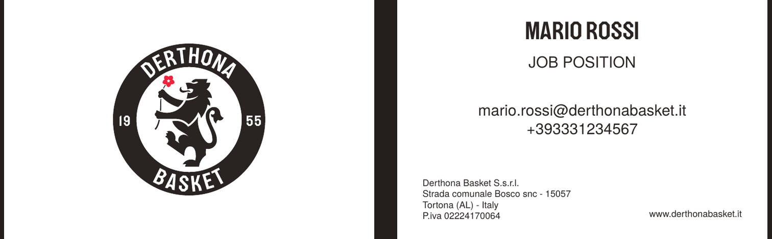
Business card
Final approved front-and-back artwork.
Letterheads
Three A4 layout options.

06
Visual language
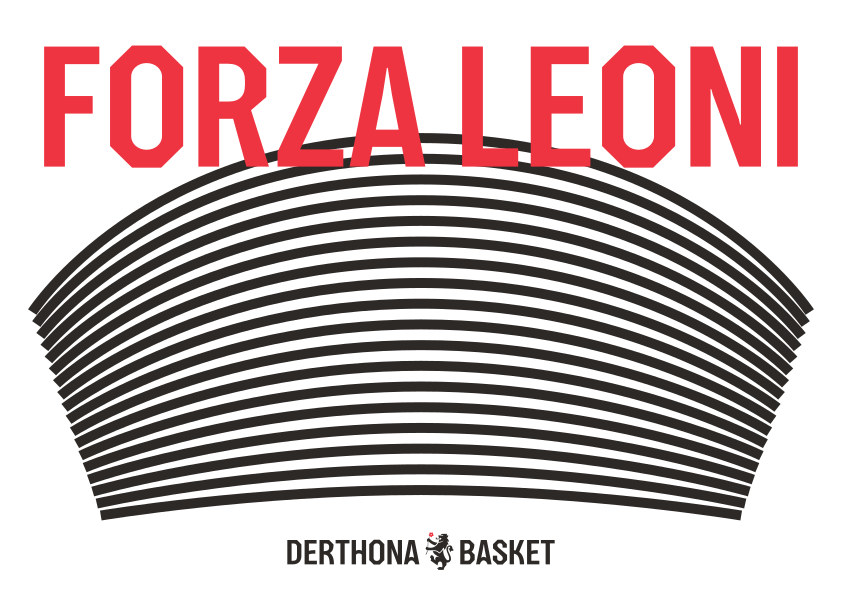
A graphic gesture where basketball and territory meet.
The concept
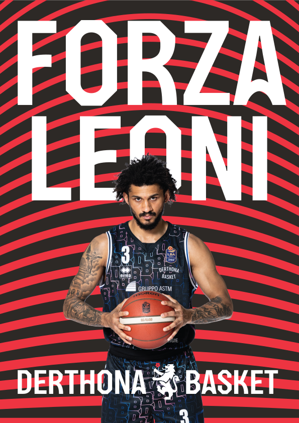
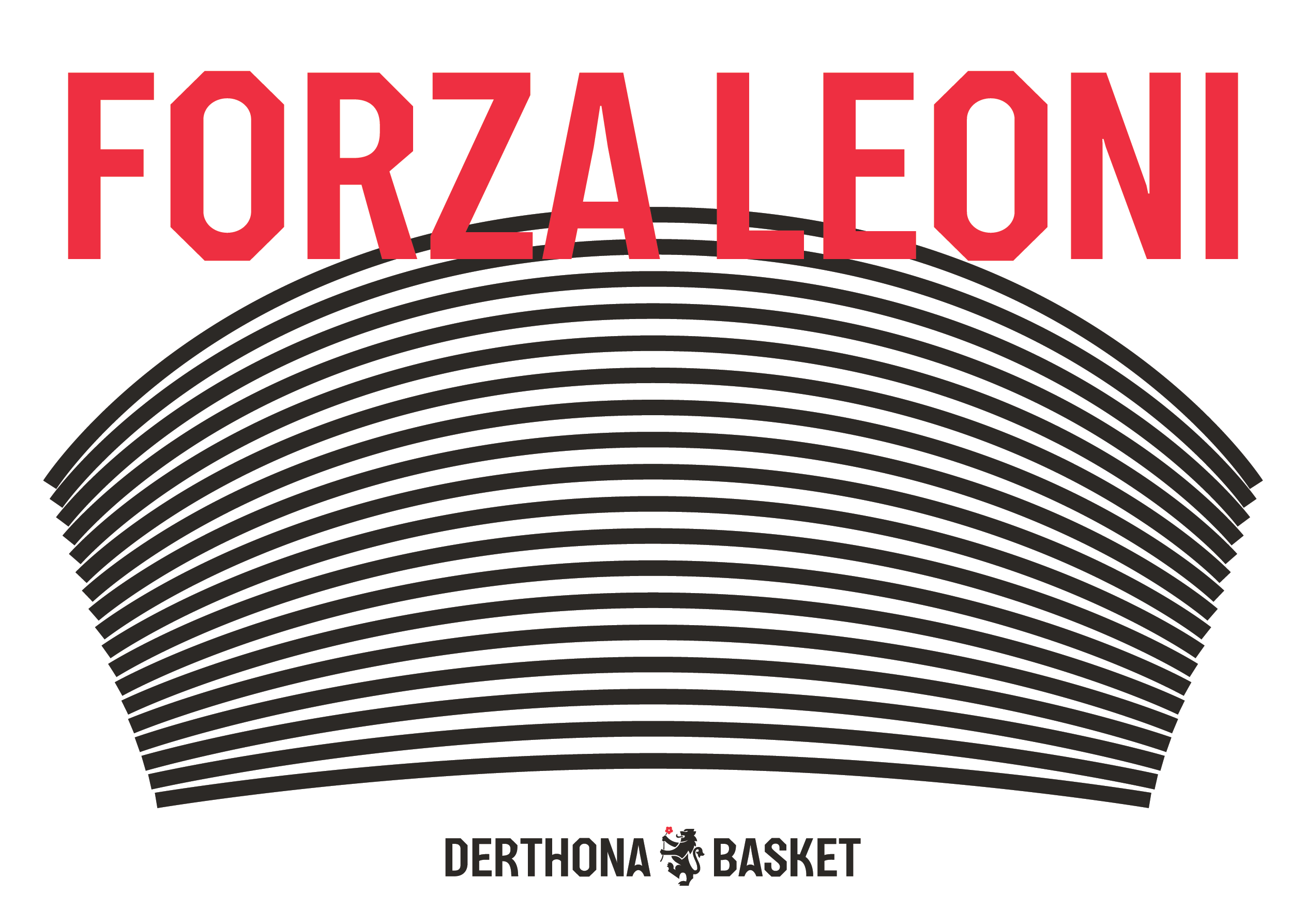
The Curve echoes the trajectory of the ball, the energy of the Curva, the hills surrounding Tortona and the vaulted forms of Pier Luigi Nervi’s Magazzini del Sale. Through repetition and scale, these references become a dynamic and distinctive graphic language.